The Venice Biennale is a world famous art exposition held every two years, from June until November, in several locations in the city of Venice. The main location, the Giardini (gardens in Italian), house twenty-eight pavilions, some of which have been in use for over a hundred years now. Their main function is to be able to effectively showcase the art that the participating countries wish to show the world, but let’s forget about all that and instead take a look at the pavilions themselves!
Before we begin, we must consider: how should a national pavilion for an art exhibition look? Countries that have a defined architectural identity often choose to have their pavilion reflect typical architecture from their country. Of course, ideas about architecture drastically changed over the course of the twentieth century. This is important, because barely any of the pavilions were built at the same time. Moreover, many pavilions got rebuilt, renovated or expanded over time. However, the Biennale is still an art exhibition, and this has a couple of repercussions. For example, some countries choose to make their pavilion as impersonal as possible in order to eliminate distraction and put the focus on the art. Others instead try to incorporate the art into the architecture in a literal sense, like by changing up the pavilion slightly to fit the style of the shown art. All this make the Giardini a very architecturally diverse environment.
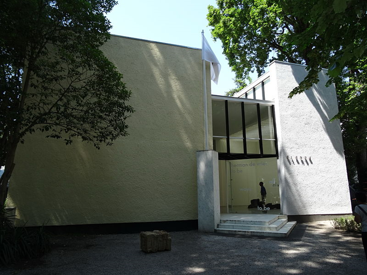
The Dutch pavilion is a fitting start to our virtual tour. It is not hard to guess who designed it, even without knowing that it is also often referred to as the Rietveld pavilion. As is usual for Rietveld, space and light are major themes in the design. The differentiation in height of the walls allows for light to enter the building from above. The pavilion has a square floor plan and only a small number of inner walls, which makes it so that the architecture does not distract visitors from the art.
Figure 1: Dutch Pavilion, retrieved January 23, 2025, from https://commons.wikimedia.org/wiki/File:Herman_de_vries_in_the_dutch_pavillion.jpg
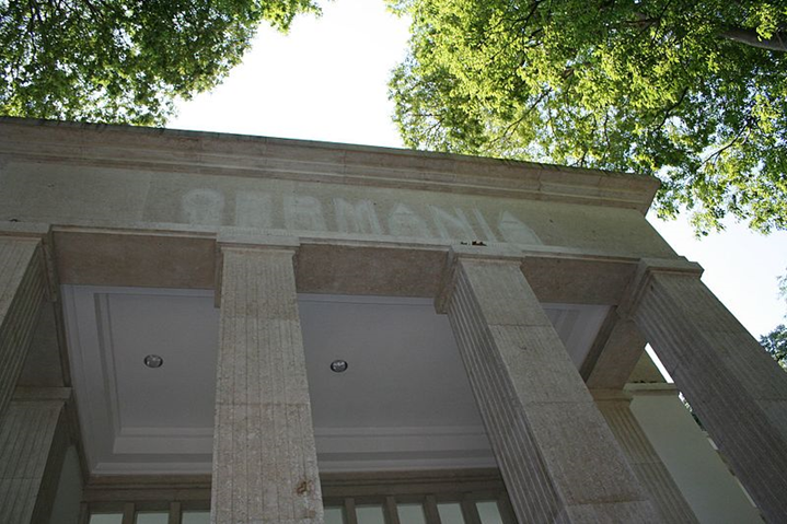
The German pavilion at first sight seems very inappropriate. Well, it kind of is. It was built in 1938 which is clearly visible. The neoclassical, monumental style which it is built in, and the word ‘’GERMANIA’’ on the tympanum all seem to celebrate a dark page in the history book of Germany. However, it still stands to this day, as a reminder of the history of the country and of a time when art expositions were politically motivated in a much more propagandistic way. When you walk inside the pavilion, you are most often greeted with contemporary and politically independent art, which gives an uplifting effect. It could indeed be said that the harsh and appalling exterior strengthens the message of whatever is exhibited inside.
Figure 2: German Pavilion, retrieved January 23, 2025, from https://commons.wikimedia.org/wiki/File:Pavilion_Germania_biennale_art_2009.jpg
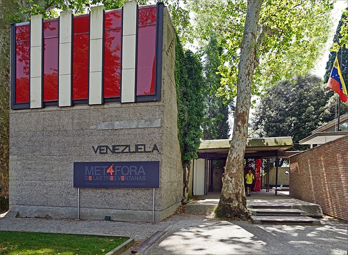
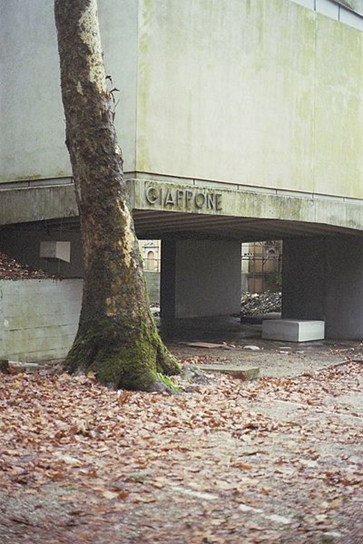
The Venezuelan pavilion was designed by Carlos Scarpa, an instance of a country choosing a foreign architect for their pavilion. Its robust concrete walls contrast heavily with the smooth surfaces of its neighbors, the Swiss pavilion and the Russian pavilion. The building, full of beautiful little details, uses of material and light, and interactions, has however sadly been deteriorating for some time due to the lack of funding for the arts from the Venezuelan government. I highly encourage anyone who has the means to visit the Biennale just to be able to admire this pavilion in all its detail, as it is difficult to put into words the attention to detail that is put into it. These details are not put in your face and it is still built as to be in service of the art on display, but are still very fun to spot for admirers of architecture.
Figure 3: Venezuelan Pavilion, retrieved January 25, 2025, from https://commons.wikimedia.org/wiki/File:Le_pavillon_du_V%C3%A9n%C3%A9zuela_(Biennale_de_Venise_2019)_(48094271267).jpg
The French pavilion, British pavilion and the American pavilion share many similarities. All three were built between 1909 and 1930, a time when classical architecture was still very much the preference for public buildings. A fun feature of the American pavilion, which some other pavilions copy, is that the stale neoclassical look is switched up slightly to fit the art exhibited inside. This is a good way to make use of pavilions, as they can be easily deconstructed, rebuilt, and changed up.
Figure 4: American Pavilion, own photograph
However nationalistic or architecturally refined the pavilions can seem, most make sure to let the art speak for itself inside the space. There are however some exceptions, one of them being the Japanese pavilion. It is elevated with concrete pilotis and has an opening in the floor and ceiling, making interactions between the roofed ground floor and the first floor a point of attention for Japanese artists. Because of this, vertical, multi-part installations are often placed there.
Figure 5: Japanese Pavilion, retrieved January 25, 2025, from https://commons.wikimedia.org/wiki/File:Japanese_pavilion_at_the_Venice_biennial.jpg
An architectural highlight of the exposition, and another pavilion that encourages the fusion of the exhibited art and architecture, is the Nordic pavilion. The space does not seem to have any shadows. This is due to the grid-like pattern of light wells in the roof, that is only interrupted by 3 plane trees inside the pavilion. These trees, that have stood here before construction began, often cause fun and interesting interactions between the exhibited art and architecture, as they are placed semi-centrally. The tree bark is the only dark color found in the pavilion, as the rest of the building consists of slender, light concrete and glass. All this, combined with its simple rectangular floor plan, makes for a harmonious space that allows the art to, quite literally, shine. Fun fact: before the construction of the Nordic pavilion was completed, Finland had its own pavilion which was designed by Alvar Aalto!
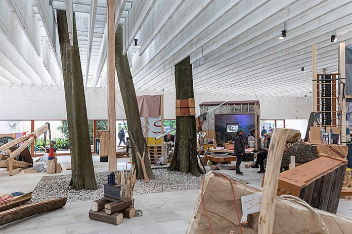
Figure 6: Nordic Countries Pavilion (interior), retrieved January 25, 2025, from https://commons.wikimedia.org/wiki/File:Girjegumpi_%E2%80%93_The_S%C3%A1mi_Architecture_Library_by_Joar_Nango_and_collaborators_at_the_Nordic_Countries_Pavilion_(18th_International_Architecture_Exhibition_%E2%80%93_La_Biennale_di_Venezia)_7.jpg
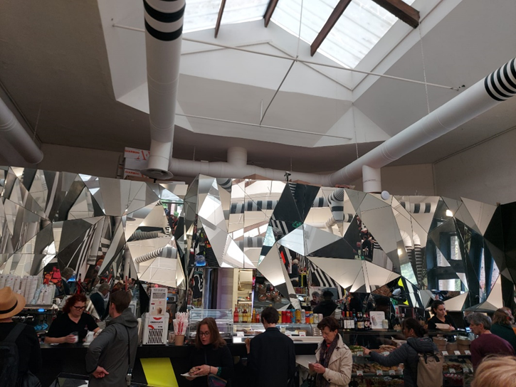
After a long day of admiring pavilion architecture, one can sit down in the cafeteria, which is inspired by dazzle camouflage used for UK and US battleships in the World Wars. The disorienting pattern of black, white and colored stripes combined with an enormous fragmented mirror behind the counter make for a very overwhelming space, fitting for how crowded it often gets.
Figure 7: Biennale Cafeteria, own photograph
The way countries have designed the backdrop for their cultural pride is interesting to witness in the Giardini. The architecture on display at the Venice Biennale is something that anyone passionate about art and architecture should once stop by. For those that are less enthusiastic about contemporary art, there is also an Architecture Biennale, which is also held at the Giardini, however with less participating countries and less popularity. In any case, there’s no excuse not to come!


_(48094271267).jpg)
_7.jpg)